Feeds:
Posts
Comments

Posts Tagged ‘art exhibitions / art museums / art shows’

Just a few days ago, it was the 149th anniversary of first impressionist exhibition, held at 35 Boulevard des Capucines in Paris from April 15 to May 15, 1874, doors open 10 am – 6 pm, 8 pm – 10 pm. This little fact led me down a blooming spring path of reading up on the event and the subsequent seven exhibitions, the last of which was in 1886. All in all, the recurrence of these exhibitions was amazing, especially given the number of artist egos and practicalities (such as money) involved.

I began with this excellent Artchive summation and wound up reading all of the summaries from Impressionist Art.com, which covered seven of the eight with a wealth of images, facts, plus a few typos and opinions (e.g., Caillebotte was handsome), and then the quick summary from ThoughtCo.

These artists, from Morisot and Monet to Degas and Cezanne, and the rest of the lot (e.g., Marie Bracquemond, and paternal Manet hovering in the background) are some of my very favorites, and the world they inhabited with its art dealers and crowds, internal and external politics, and witty prose reactions, is, in a word, rich. And obscurities abound, such as the notoriety of Jean-François Raffaëlli, who I knew only from one painting in one of the Art Institute’s 19th-century galleries.

With all I learned, the most interesting must be that in some instances the artists chose how to display their pictures contrary to academic ways (no surprise there, I guess, since this is what the exhibition was all about). Pissarro’s and Cassatt’s frames were two discussed, along with the ways some artists were given their own galleries and some featured in the front of the exhibition, some (the more challenging ones) at the back.

This led me to this little illuminating article from Australia’s AnArt4Life blog, highlighting both the simple colored frames used, the color of the paint on the walls behind the paintings, as well as how the paintings were displayed to as to be appreciated much more easily and individually. It just so happens this article’s writers are in Melbourne, Victoria, where I once happened to visit some of their museum galleries with a person who had a knack for pointing out how the frames of the paintings affected and enhanced the experience.

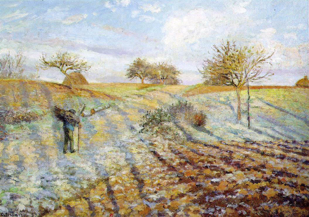
Well, there you have it, a dully prosaic write-up on one of the most lyrical times in art history. I hope you find something to enjoy in it, despite the stilts. I’ll leave with a couple images from Pissarro, whose role (and work) I came to appreciate more thanks to this exercise. I am enjoying imagining how we would have preferred to display these: venue, wall, frame, and all.

Gelée blanche (Hoar Frost / White Frost) by Camille Pissarro, 1873. Displayed at the First Impressionist Exhibition. Source: Wikimedia Commons.
Les châtaigniers à Osny (The Chestnut Trees at Osny) by Camille Pissarro, 1873. Also displayed at the 1874 exhibition. Source: Wikimedia Commons.

Read Full Post »

As a former Classics minor and regular museum attendee of minor prestige, I have off-and-on read bits and pieces about how ancient sculpture was anything but monochromatic. If you go to museums these days you start to notice casts of color on ancient objects more than ever before, either because of the buzz about the topic and/or because these pieces are now being showcased.

It’s one of those times of year I wish I was visiting NYC. I spent a lovely summer there long ago and used to visit now and then when I knew people who lived there. Add to that an out-of-the-blue recent conversation I had on a cool New York Public Library exhibition of their collection’s treasures. And then there’s this article from yesterday’s New York Times on the Met’s “Chroma: Ancient Sculpture in Color” show, which features “colorized” versions of ancient sculptures, a public culmination of the studies of the Brinkmanns, a scholarly couple who have been at this for decades. Well, it makes me wish I could hop on planes and trains like I used to, or at least makes me think about studying something interesting like this in depth.

The article covers a lot of ground on ancient polychromy, including a new angle I’d not encountered, namely that by seeing only monochromatic (usually white/whitish marble) human figures in ancient art, our aesthetic and racial views of the world are significantly affected. Check this out for more on that.

Well, that’s plenty of links for you to peruse. But what really intrigued me about the Times article was this:

“However, some historians worry that the Met Museum has elevated the increasingly ubiquitous Brinkmann replicas to an iconic status that is becoming the default representation of ancient polychromy, when the couple’s research is just one among dozens of competing theories. The debate now encompasses more than a disagreement about pigments and scientific method; some academics see the reconstructions as a larger discussion on who gets to define the past.”

As much as I’d like to see the Chroma exhibit in person—and there’s a lot to it, including a fascinating glossary that includes ancient pigments—what I’d really love to see is an exhibit covering these dozens of competing theories, including replicas, succinct write-ups, lectures, evidence, etc. Maybe Chroma will feature some of this—I have not consulted its calendar. I can always resort to books and journals, but what a wonder such an exhibit would be. For that I would hop on the next plane and figure out somewhere and some way to stay in New York for a spell.

Ancient statue of a woman with blue and gilt garment, fan and sun hat, from Tanagra, Greece, 325–300 B.C. Exhibited in Berlin’s Altes Museum. Source: Wikipedia.

Read Full Post »